Title Card Horror

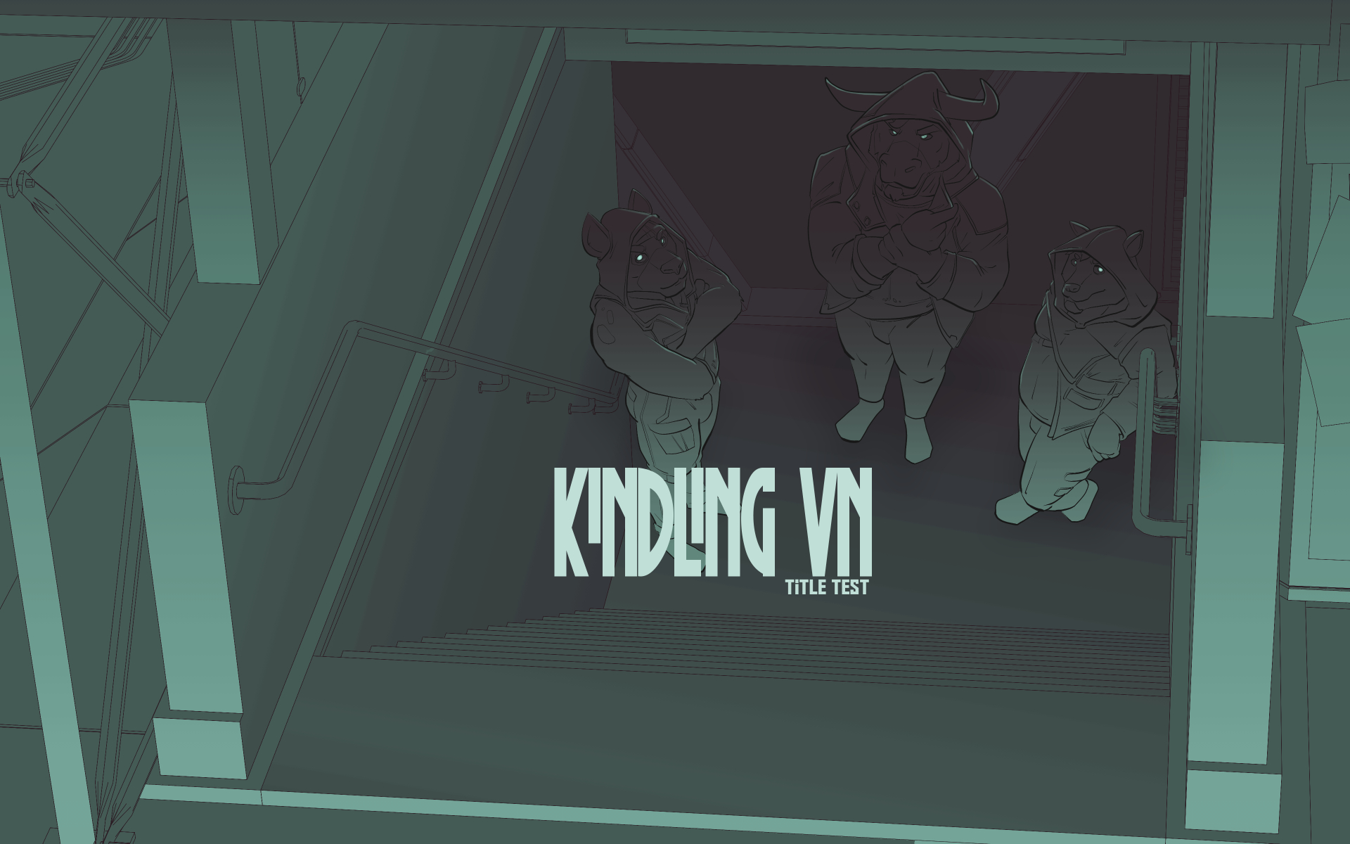
Rough Layout for an updated Title Card.
The first attempt at the title card two years ago really was to set quickly establish the setting and the characters. I definitely went to my comfort zone of Big-Dudes being very present in the space. Afterall, make the things that appeal to yourself before anyone else. That adage of being a fan of your own work. With the changes to the character sprites it's also important to update the chain of other artwork.
This isn't the final pass on a title card. But I certainly want to emphasize some of the horror elements. I tend to forget how much I really do enjoy horror as a genre. I can fanboi for days over Clive Barker. I've really gotten into Junji Ito over the last few years. I just sincerely appreciate the sort of tales of horror that have something to say. Give me more 'Nope' and its message of consuming the people who make up the Hollywood Industrial Complex. Give me 'The Fault of Amigara' and how trying to fit into the holes prescribed by society will warp you into a something inhuman.
The new layout is more about going deeper rather than looking up at the city lights. They're more distant now.. but they've got such sights to show you.
kindling
Do the things we lose stay lost forever?
| Status | In development |
| Author | mykanthrope |
| Genre | Visual Novel |
| Tags | Bara, Cyberpunk, Furry, Gay, Horror, LGBT, Psychological Horror, Sci-fi |
More posts
- Background ProcessJan 13, 2024
- devlog: 06Jan24Jan 06, 2024
- 66.6 Percent Live2DDec 23, 2023
- Reverse Sprites + Live2DMar 31, 2023
- Sprite ProcessDec 23, 2022
- CharactersNov 18, 2022
- CGs and LayersAug 27, 2022
- Text Printers and TechAug 20, 2022
- UI ElementsAug 13, 2022
Leave a comment
Log in with itch.io to leave a comment.